Column
You can customize each Table column separately by accessing properties through the gear icon ⚙️ in the Table's properties pane. This includes editing existing column properties, adding new custom columns, rearranging columns, and hiding columns.
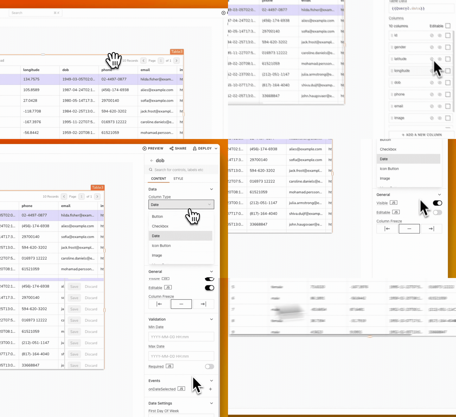
Content properties
These properties are customizable options available in the property pane of the Column settings.
Column Types
This property allows you to select the appropriate column type for your Table data. Each column type serves a specific function and enhances interactivity. The available column types are:
-
Button: A clickable cell that triggers an onClick event, allowing users to perform actions directly from the Table. The triggeredRow reference property retrieves data from the corresponding row, making it easy to reference that specific entry.
-
Checkbox: Represents a binary value (True/False) and displays checked and unchecked states. You can interact with this column to toggle values. If the Editable property is enabled, you can modify the state directly. If the Editable property is disabled, selecting the checkbox is not possible.
-
Icon Button: A button that displays an icon instead of text. You can configure the onClick event to trigger specific actions. The
triggeredRowreference property retrieves data from the associated row, similar to the Button type. -
Image: Displays images by interpreting the cell value as an image source URL or base64 data. If the data is invalid, the cell displays
Invalid Image. -
Menu Button: A set of buttons that expands into a menu when interacted with. You can dynamically add menu items by setting the Menu items source to Dynamic, referencing
{{currentRow}}in the Source Data property for easy integration with the Table's data. -
Number: Designed for numeric data entry, this column type supports inline editing, allowing modification of values directly within the Table.
-
Plain Text: Displays readable characters for clear understanding. This column type supports inline editing, allowing direct text updates when the Editable property is enabled.
-
Switch: A toggle feature that allows you to turn an item on or off, representing binary values. This column type supports inline editing, allowing direct text updates when the Editable property is enabled.
-
URL: Treats the cell value as a hyperlink, allowing clicks on the cell to open the corresponding URL in a new browser tab. Ensure to include both the domain and suffix of the URL for proper functionality.
-
Video: Displays videos directly within the Table. You can add videos by providing a source file path or URL from supported platforms like YouTube, Facebook, Twitch, and others, enhancing multimedia engagement.
-
Date: Supports custom formatting options for date and time information. You can format and display the date using the Date Format and Display Format properties. This column type supports inline editing, allowing direct text updates when the Editable property is enabled.
-
Select: Enables choosing from a predefined list of options. The Options property should be an array of objects. This column type supports inline editing, allowing direct text updates when the Editable property is enabled. See Select properties.
Computed value
This property allows you to display and manipulate Table data using JavaScript expressions. The currentRow property is automatically generated when data is added to the Table, representing the current row's data.
Example: To display a date of birth in a column named dob, use:
{{currentRow['dob']}}
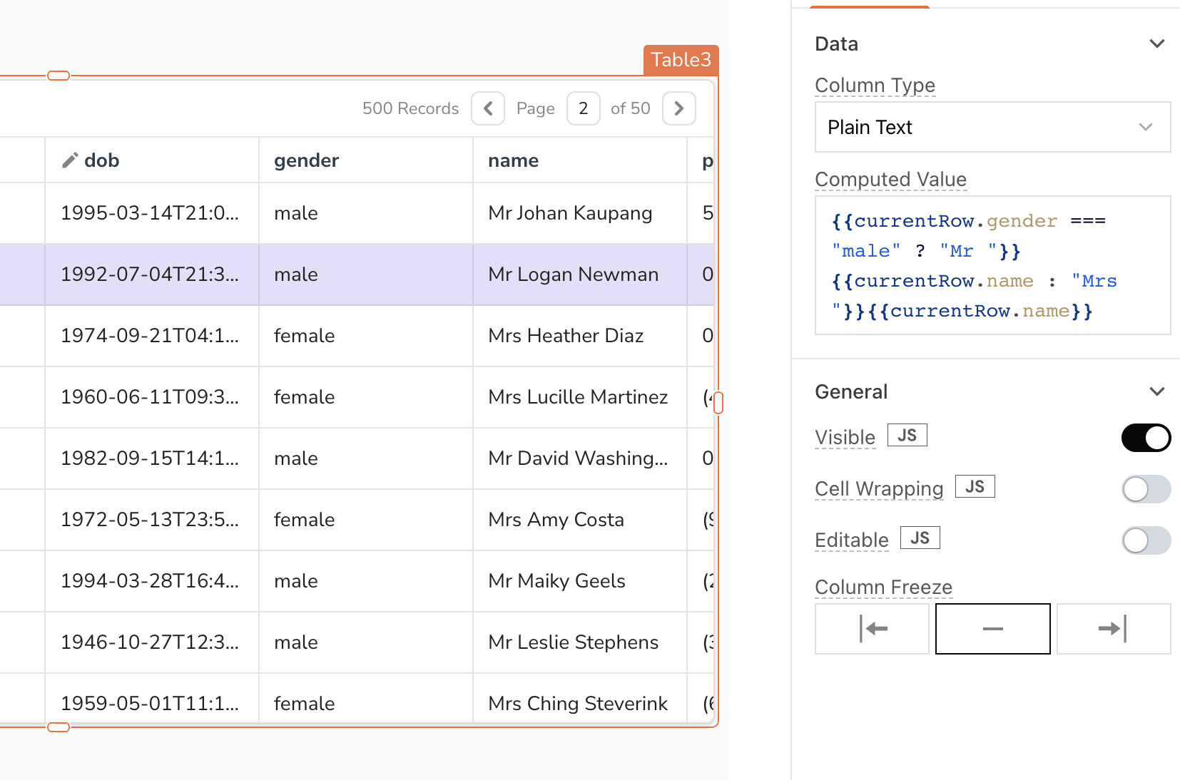
Example 2: If you want to add a prefix like Mr. or Mrs. to names in the name column based on the gender column, you can use a computed value:
{{currentRow.gender === "male" ? "Mr " + currentRow.name : "Mrs " + currentRow.name}}
The code uses a ternary operator to add a prefix of Mr. or Mrs. to the name column based on the value of the gender column in the current row.
Currency string
This property allows you to specify the currency type for the column. You can select from a list of countries and their corresponding currencies. Additionally, by enabling the JS option, you can use ISO 4217 currency codes, which are three-letter codes assigned to each currency for international identification.
Decimals Allowed number
This property defines the maximum number of decimal places permitted. You can set it to 0, 1, or 2, depending on the level of precision required for the numeric value. This setting is only applicable when the column type is set to Currency.
Notation string
This property determines how the currency is displayed. It offers two options:
-
Standard: Displays the full currency value (e.g., $1,000.00).
-
Compact: Displays the currency in a shorter format (e.g., $1K for 1,000).
This setting is applicable only when the column type is set to Currency.
Date Format string
This property specifies how incoming date data is formatted in the Computed Value property. For instance, if the incoming date is in the format YYYY-MM-DD HH:mm and matches the Date Format property, the date displays correctly. If the formats do not match, the column shows Invalid date. This setting applies only when the column type is set to Date.
Display Format string
This property determines how the date appears to the user. For example, if the incoming date is in the format YYYY-MM-DD and you want to display it as DD/MM/YYYY, the date shows up in the selected format. This setting applies only when the column type is set to Date.
Basic
Text
This property specifies the label for the column type. For instance, when the column type is set to Button, you can use this property to define the Button's label.
Menu items source string
This property allows you to specify the source of the menu items.
Options:
-
Static: When the Static option is selected, the Menu Items property becomes visible, enabling you to add and manage the menu items directly from the UI. Click the ⚙️ gear icon to access the configuration options. For more information, see Menu Items.
-
Dynamic: With the Dynamic source, menu items are populated by binding a query to the Source data. To configure the properties of the menu items, click the Configure Menu Item button. The menu items do not display until configured using the
currentItemorcurrentIndexproperty.
Source data array
This property is used to provide the data for dynamic menus. It accepts an array of values that can be defined statically or derived from any query.
Example:
{{[
  { "label": "Admin", "value": "admin" },
  { "label": "Editor", "value": "editor" },
  { "label": "Viewer", "value": "viewer" }
]}}
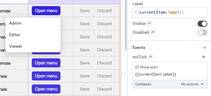
Once you have configured the Source Data, you need to configure the Menu items to display the data. You can reference the menu item using {{currentItem.label}} to dynamically populate the menu based on the specified values.
Configure menu items string
This property allows you to configure the menu items defined in the Source Data property. When you click on the Configure button, you can update the styles and label properties.
To display the menu items, you need to set the label property using either currentItem or currentIndex to reference the corresponding values.
Example:
{{currentItem.label}}
Icon
This property specifies the icon displayed on the button. You can also use JavaScript to dynamically set the icon. Appsmith uses icons from the Blueprintjs library.
General
General properties are essential configurations that provide overall control over the widget's behavior and appearance.
Visible boolean
This property controls the visibility of the column. If set to false, the entire column is hidden from view in the Table.
Cell Wrapping boolean
This property allows the content of the cell to be wrapped, enabling the display of longer text within the cell without overflowing.
Editable boolean
You can enable the Editable property by selecting the option in the individual column settings of the Table. By enabling inline editing and marking specific columns as Editable, users can update data directly from the UI by double-clicking on the desired cell.
Additionally, you can control this property conditionally by clicking on JS next to the Editable option. For more information on all the editable properties, including validation, settings, and related events, see Inline Editing.
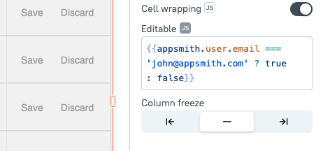
Example: To allow only certain users to edit the Table, open the column settings, click JS next to the Editable property, and add your code:
{{appsmith.user.email === 'john@appsmith.com' ? true : false}}
This code checks if the email of the logged-in user is john@appsmith.com. If it is, the property is set to true, making the column editable. If it is not, the property is set to false, keeping the column non-editable.
For more information on setting up queries to edit or add rows using inline editing, see Edit Table Data Inline..
Column Freeze boolean
This property allows you to freeze or unfreeze a column, keeping it fixed to the left or right of the Table as users scroll horizontally.
Disabled boolean
This property disables user input for the column. While the column remains visible, users will not be able to interact or make changes to it.
Select properties
These properties become available only when the column type is set to Select. They enable you to customize the behavior and appearance of the select column
Options array
This property defines the options to be displayed in the select dropdown. It should be provided as an array of objects, where each object contains a label and a value.
Example: If you want to create a gender selection dropdown, you could define the options as follows:
{{[
  {"label": "Male", "value": "male"},
  {"label": "Female", "value": "female"}
]}}
Placeholder string
The placeholder is instructional text shown in an input field when it is empty. It indicates what type of information is expected, helping users understand how to fill out the field.
Filterable boolean
This property allows you to add a search bar to the dropdown list, enabling users to quickly find options by typing in the input field. This setting is only available when the column type is set to Select.
Reset filter text on close boolean
When enabled, this property clears any text typed in the dropdown's search bar when the dropdown closes. This ensures the input field is empty for future searches when the dropdown is reopened.
Server Side Filtering boolean
This property enables server-side filtering of the dropdown data. When set to true, the application sends filter queries to the server based on user input, retrieving only the relevant options. This is beneficial for large datasets, improving performance and reducing loading times by fetching only necessary items as users type.
Style
Style properties let you customize the appearance of each column, including text alignment, colors, and fonts.
Text formatting
The Text Formatting properties allow you to customize the appearance of the text in the Widget.
Text size string
Specifies the size of the text in the column. Options include Small (S), Medium (M), Large (L), and Extra Large (XL).
Emphasis string
Specifies the text styling options for the column. You can choose from Bold, Italic, and Underline, and select multiple options if needed to apply different styles.
Text/Horizontal alignment string
Controls the horizontal alignment of text/button within the column. Options include Left, Center, and Right alignment.
Vertical alignment string
Sets the vertical alignment of the text/button within the column. Options include Top, Middle, and Bottom alignment.
Border Radius
Allows you to apply rounded corners to cells within the column.
Box Shadow
Adds a shadow effect to the cells in the column, giving them a raised appearance.
Button Variant
Specifies the visual style for buttons in the column, such as primary, secondary, or custom styles.
Button Color
Sets the background color of buttons within the column.
Cell Background (Column Color)
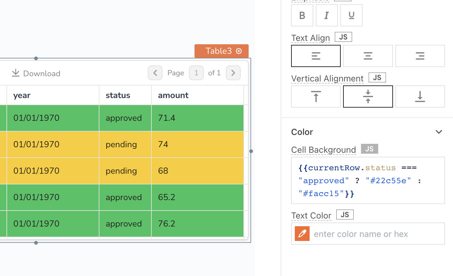
You can style each column type from the style property pane, including options to change column color. However, if you need more advanced customization, such as changing Table color/column color, you can use the currentRow and currentIndex references to create custom color expressions. These expressions enable you to conditionally change color and style of individual cells based on their content, offering more flexibility than simply applying a static style to an entire column.
Example: You have a column named status that reflects approved and pending values. You can set the color for these values using the following expression in the Cell Background property:
{{currentRow.status === "approved" ? "#22c55e" : "#facc15"}}
If you want to keep the same background color for an entire row, you can use the same custom style expression in each column Cell Background property.
Text Color
This property allows you to define the color of the text displayed in the column. By customizing text color, you can improve readability and emphasize important information for users.
Example: To display the status of a project with different colors, you can use the following code:
{{ currentRow.status === "completed" ? "#28a745" : currentRow.status === "in-progress" ? "#ffc107" : "#dc3545" }}
Image Size
This property adjusts the size of images within an Image column type. You can choose from predefined sizes such as Small, Medium, or Large, ensuring that the images fit well within the layout of the Table without disrupting the overall design.